New and Improved
For the last few weeks, I’ve been working on something new. It’s also something that is improved for people who have difficulty reading books in regular font sizes. I’ve been creating Large Print editions of The Owen Family Saga.
The first book is the origin story of the Owen Family, the prequel to the Owen Family Saga series, entitled THAT TENDER LIGHT, in which Rod Owen and Julia Helm meet on a spring day in 1840. It was love at first sight, which was fortunate, because after her cousin’s wedding took place in Virginia, Julia was going to return home to Pennsylvania. If she left, Rod probably never would have seen her again. But love found a way to keep her from leaving.
In preparing the large print books, I referenced advice from the Council of Citizens with Low Vision International, an affiliate of the American Council of the Blind, and the American Printing House for the Blind. All text is aligned left with a ragged right margin, uses 18-point font or better, and italics are shown by underlining words. Arial, a sans-serif font, was used in THAT TENDER LIGHT.
If you’re on the look-out for Large Print books, for yourself or an avid reader with low vision, these books will be a real blessing. My plan is to release one book or volume of a book twice a month, if possible.
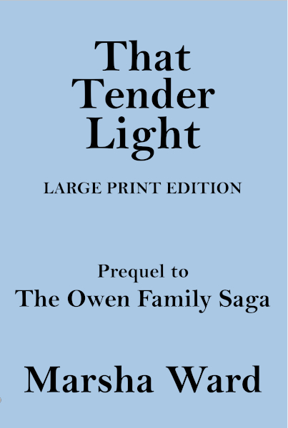
THAT TENDER LIGHT: An Owen Family Novella, was released at the end of July, and is now available on Amazon. Look for the plain blue cover.
Share This:


Leave a Reply